

The Psychology Of Color: How Can Colors Change Your Emotions?
There is no denying that color can actually have an effect on a person. While this will not seem like a news flash to anyone, many people are actually surprised at just how big of an effect colors can have on you psychologically once you fully dive in. The study of how color affects people and their actions is referred to as color psychology, and a systematic review spanning 128 years of psychological research confirms that humans systematically and reliably associate specific colors with specific emotions.

Color really does affect everything. The color of food can affect taste, the color of a room can affect the emotional mood of people, and the color of a shirt can actually help determine if you are more or less attractive to others. For many people, it is hard to believe that colors can have this type of effect, but it all can be traced to one proven, though not fully understood, truth: color affects mood.
Before We Go Too Deep Down the Rabbit Hole
One really important factor that needs to be talked about when it comes to color is culture. The culture a person is raised in can radically change how they react to color, suggesting there is definitely a taught aspect to this. In some cultures, a color might be good luck while in others that same color is a bad omen. In those cases, the color is still going to affect both people's moods - but in very different ways. A cross-cultural study of indoor work environments published in the journal Ergonomics found that the impact of color on psychological mood varied significantly across cultures in Argentina, Saudi Arabia, Sweden, and the UK.
Another way to say this is that the cultural symbolism of colors changes how a color may affect you.
While this article is really going to dive into colors and the ability to use certain colors to elevate or boost your mood, if you are from a culture with a different tradition around colors then by all means make sure to adjust the information here to fit your background. The connection between our environment and emotional state runs deep - for more on this, explore how your environment can contribute to stress.
In addition to this, strong memories or personal experiences can also paint a very different picture of a certain color for that individual. Colors are not magic, after all, but they are an interesting piece of a larger puzzle of the things that affect our mood in everyday situations and life in general.
Why Does Color Affect Mood?
The strange thing is, as much as we know about color, there are some basic things that we do not really understand. The "why" behind "why does color affect mood" is one that we do not fully know. While a lot of basic knowledge is known about color psychology, it is actually kind of surprising how most of the evidence is experience-based, since not nearly as much empirical study has been done as you would expect. WebMD's overview of color psychology notes that while the field is still developing, researchers have documented measurable effects of color on emotions, behaviors, and mental health.
However, just because there is not a confirmed biological reason for why color affects our mood, there are actually some pretty good answers. Well, at least partial answers, anyway.
One is that color is tied to sense. Sight is one of the five senses, and color is a natural way to interpret what you are seeing and to differentiate one thing from another. The National Eye Institute explains how the retina contains specialized cone cells that respond to different wavelengths of light, which our brain interprets as color. That sets the basis. Beyond that, there is no question that cultural symbolism and cultural traditions play a major part in how moods change or react based on color.
If these two things do not make up the full reason why color affects mood, then they are certainly going to be the two largest factors that create influence. To the best of our knowledge, that is why color can have such an effect on mood, though any physiological reasons are still somewhat of a mystery.
Where Is the Study of Color At?
No one will be surprised to learn that marketing and advertising professionals have really delved into studying how customers and consumers react to various colors. Those are industries that are always looking for a little bit of influence, and there is plenty written about colors in advertising.
However, what about more in-depth studies? How is happiness connected to color? Are there happy colors? Are there unhappy colors? Maybe most importantly: how can any of this knowledge actually be used in order to help make us happier in our everyday life? A study in the journal Psychological Research on color and emotion found that the relationship between color and emotional response depends not just on hue, but also on saturation and brightness - meaning the intensity and shade of a color matter as much as the color itself.
Warm Colors vs. Cool Colors
The first step is understanding the concept of warm colors versus cool colors. While these terms are often used in art classes, they actually offer a really interesting insight into how color affects individuals in everyday life. This makes a lot of sense when you think about it. After all, who has a more vested interest in understanding how people interact with colors than actual artists?
Remember that once again these are general statements that can change based on color, but on average there are some things in common. Warm colors can be brighter, like yellow or red, which can actually encourage a bit of stimulation and are good in limited amounts. Too much can be annoying or irritating. However, if you find yourself just a bit fatigued, a touch out of energy, feeling like you are missing a little spark of some kind, a reasonable infusion of warm colors could be the ticket to help subconsciously push you back towards that little spark of happiness once again. Pairing the right visual environment with mood-supporting aromatherapy blends can amplify the effect.
A good way to think of these warm, almost citrus-like colors is that a little goes a long way.
So what does this mean for the so-called cool colors?
These tend to be popular when looking for a calming or peaceful effect, two things that might not be the same as happiness but for many people, the two will go hand in hand. Greens and blues especially tend to be considered very restful, relaxing, and calming. In fact, there is even some potential science behind this belief, seeing as how the eye focuses the color green (and similar blues on the spectrum) on the retina. This means less effort to see it and thus less physical strain on your eye muscles.

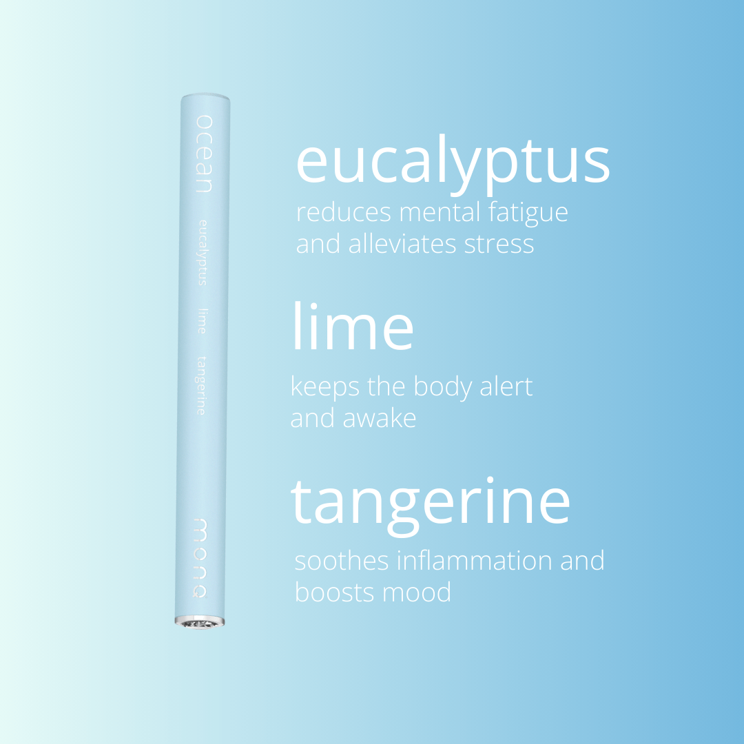
Blues are great for high traffic rooms and bedrooms. In fact, blue has been found cross-culturally to be one of the consistently favorite colors. This makes it ideal for places where you want to meditate, rest, or get away from the stresses of the day. This makes blue a potentially very powerful color when it comes to encouraging relaxation and setting up the foundation for happiness. Doubly so if a relaxing blue room includes aromatherapy for your you-time. The Ocean MONQ blend, with its fresh aquatic notes, pairs naturally with blue-toned environments.
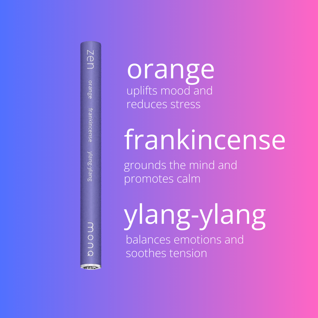
On the other hand, if you want some creative energy and charge because you are happier and more engaging, go darker with purple. Purple is that blend of red and blue that gives some peace and calm and some stimulation and encouragement. This is potentially a pretty impressive combination for the right person.
Why Narrowing Down Colors Is Tricky
Even in color psychology, rarely does anyone try to narrow down a color to one meaning. A major reason for this is cultural. Even ignoring the fact that you are going to have different memories, feelings, and experiences with certain colors rather than others, many colors have more than one symbolic or cultural meaning - and sometimes those meanings can seem very contradictory.
What does the color black mean for you? Death? Mourning? Evil? Or does it symbolize authority like a nice suit, formality, and class like a tuxedo or elegant dress? None of these thoughts are wrong, and in fact these are just some of the different things that the color black can symbolize.
Take red as another example. Does it mean power, blood, strength, and war? Or does the color red bring up images of roses, love, passion, or desire? You could argue that those two groups of responses are on pretty opposite sides of the spectrum when it comes to symbolism.
Yet in many Western cultures red does indeed represent all of those things. This just goes to show the challenge of trying to detail how color affects mood - because what two people see in the same color can be radically different things.
Are There Naturally "Happy" Colors?
There are some colors that tend to encourage happiness more often than not, and vice-versa. Think of these as more of guidelines than hard and fast rules. So what are those colors?
First of all, there is blue. There is no other color that seems to get the universal love across gender lines and cultural lines than blue does (though interestingly enough there is one universally "disliked" color on the other side of the spectrum - take a look at the next section for that one). So it should not come as much of a surprise that blue tops the list as a potential happy color.
Green comes in as the second favorite color for men and third for women, and its close relation to blue makes it a really solid choice. Keep in mind that shade does matter. There is a big difference between pine green and "puke green," and you do not want to find yourself trying to make the latter one work. The calming effect of green may be connected to the same biophilic response that makes spending time among green canopies so restorative.
Yellow is also an okay choice in small amounts. There are a lot of people rather averse to this color because it is "too bright" in large amounts, but then again an easy association with yellow is the classic smiley face. Maybe like the traffic light, it is best seen as caution before acting.
The most interesting choice for a "happy color" just might be purple. Among women, this is actually the second favorite color and a real strong contender as a great choice for encouraging happiness. However, it is tied for the second most disliked color by men and does not even appear in statistically relevant numbers as a favorite choice for men, so overall this appears to be a very gender-based reaction in many cases.
Going with a favorite color can be tempting, and it is not necessarily a bad idea. However, remember that many colors can be stimulating in nature, and just because someone has a color that is a favorite does not mean that color will then calm their nerves or encourage happiness. There are plenty of people, for example, who love the color black but do not find it relaxing or inspiring happiness at all.
Are There Naturally "Unhappy" Colors?
Just as there are plenty of colors that can help encourage calmness or happiness in an individual, there are plenty of colors that go in the other direction as well. While having a favorite color does not mean that color will consistently be good in helping you to feel happy, the inverse might actually be true. If you dislike a certain color, chances are it is going to do very little to make you happy and it could easily make you unhappy or just heap on after a rough day.
Because of that, this section reads more like the law of averages. When it comes to the most disliked colors, there are a couple of clear standouts. Brown is the least favorite of men and the second least favorite color among women. Not surprisingly, brown does not register much at all with either gender as a favorite to balance it out.
The next most disliked is orange. Orange is tied with purple as the second least favorite color among men and is the least popular among women. There are a few more of each gender who like orange versus brown, but it is pretty clear these are the two largest losers.
So if you were planning a fall themed brown and orange paint scheme for the inside of the house, you really might want to reconsider.
The Science of Color and Scent: A Powerful Pairing
One of the most fascinating intersections in sensory science is the relationship between color and scent. While these each play on different senses - you do not see smells or smell colors - research is beginning to show that the two are more connected than previously understood. The brain processes sensory information holistically, and when visual and olfactory cues align, the emotional impact can be significantly stronger than either one alone.
Consider how the color green naturally evokes forests, freshness, and growth. When you pair a green visual environment with the woodsy, terpene-rich aroma of a Forest MONQ diffuser - containing alpha-pinene, beta-pinene, and other compounds found in real forest air - you are engaging two sensory pathways that reinforce the same emotional message: calm, grounding, renewal. The National Center for Complementary and Integrative Health recognizes aromatherapy as a practice that uses essential oils to support well-being, and the color of your environment can amplify that support.

Similarly, warm golden and yellow tones pair naturally with citrus-forward essential oil blends. The bright, uplifting visual cue of yellow connects to the energizing properties of limonene, a terpene abundant in citrus peels that has been studied for its mood-supporting effects. When your eyes see brightness and warmth at the same time your nose encounters sweet orange or lemon, the combined experience can feel more vivid and more emotionally resonant than either sensation alone.
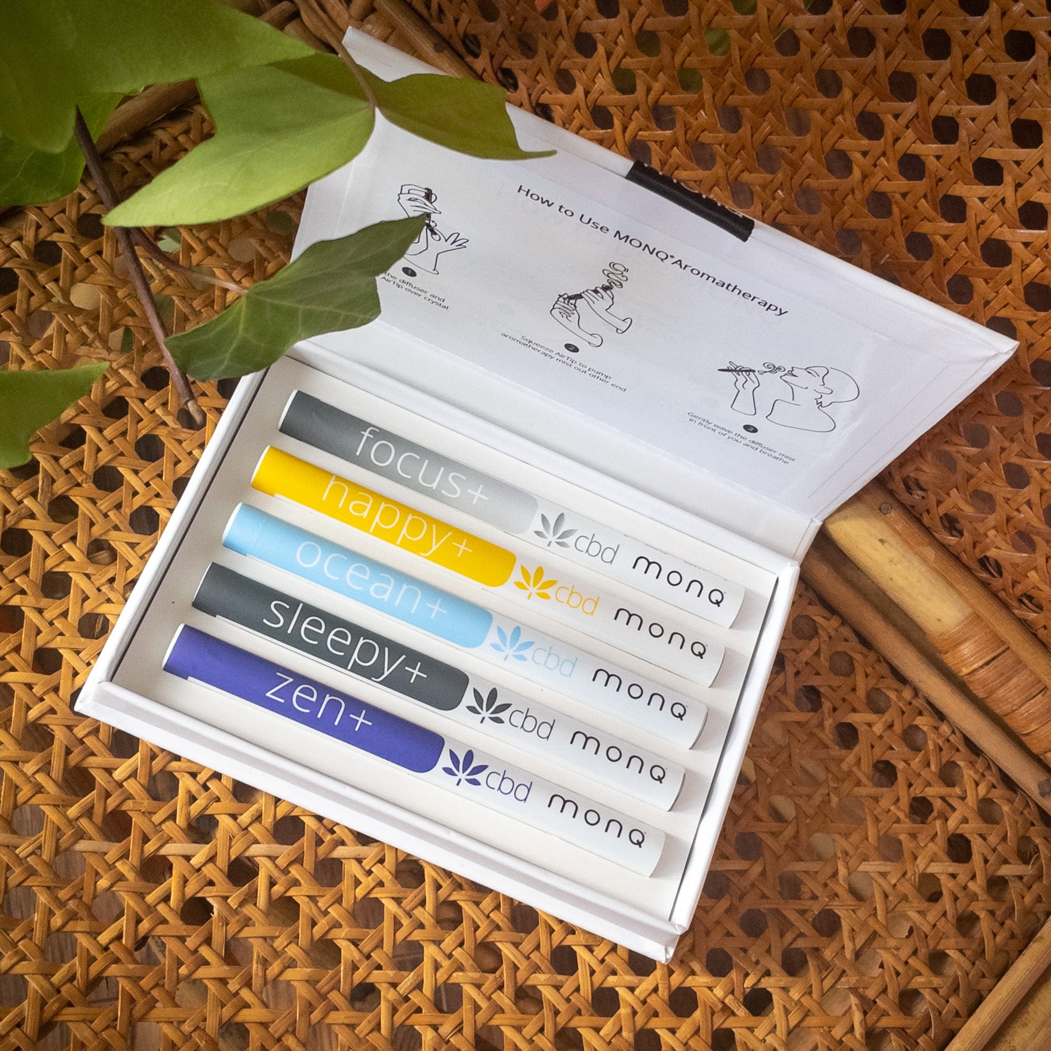
Purple and lavender tones create yet another powerful pairing. The color purple sits at the intersection of warm and cool - part stimulating, part calming - and linalool, the primary terpene in lavender essential oil, is known for promoting relaxation and calm. Using lavender-colored linens or accents in a bedroom while diffusing a calming blend creates a multi-sensory environment designed for rest. The Sleepy MONQ blend captures this principle, combining soothing botanicals with the intention of supporting restful evenings.
How to Use Color Psychology in Your Daily Life
Understanding color psychology is only half the equation. The real value comes from applying it intentionally. Here are practical ways to use color to support your mood and well-being throughout the day.
Your Morning Environment
Start the day with warm, energizing tones. A kitchen with yellow accents, a sunny breakfast nook, or even a bright orange coffee mug can provide subtle stimulation that helps you wake up and engage. Pair this visual warmth with an invigorating aromatherapy blend - the citrus and peppermint notes in Happy MONQ complement warm-toned morning environments naturally.
Your Workspace
For sustained focus and productivity, lean toward cooler tones. Green plants, blue accents, and natural light create an environment that reduces visual fatigue and supports concentration. Research on finding balance between energy and calm suggests that the ideal work environment avoids both overstimulation (too much red) and understimulation (stark white). A desk plant or a blue-green accent wall can make a measurable difference.
Your Evening Wind-Down
As the day ends, transition to cooler, darker tones. Dim warm lighting (not bright white LEDs), blues and purples, and the removal of stimulating red and orange from your visual field signal to your body that it is time to rest. This visual transition mirrors the natural color shift of sunset, and embracing the light intentionally throughout the day can support your circadian rhythm and emotional balance.
Your Aromatherapy Practice
Match your MONQ blend to your color environment. A green room naturally complements grounding, balanced blends. A blue space invites clarity and open awareness. A warm, sunny kitchen is the perfect setting for forward-moving, bright aromas. When the aromatic compounds from natural essential oils align with the visual cues your environment is sending, the combined sensory experience becomes more than the sum of its parts. Learn more about the magical dance of aromas in nature and how scent, sight, and emotion interweave.

The Bigger Picture: Color as Part of a Wellness Practice
Color psychology is not a standalone solution. It is one layer in a multi-sensory approach to well-being that includes scent, sound, touch, movement, and mindfulness. The reason it matters is that most people never think about it deliberately - they live in whatever colors their apartment came with, wear whatever is in the closet, and never consider that a simple change in their visual environment could shift their emotional baseline.
The science is still catching up to what artists and designers have known intuitively for centuries: the colors around you shape how you feel. And when you combine intentional color choices with the terpenes and botanical compounds that have supported human well-being for millennia, you create an environment that actively works for your emotional and physical health rather than against it.
Explore the full collection of MONQ diffusers to find the blend that matches your color, your mood, and your intention.
Disclaimer: The above information is provided for general wellness and educational purposes only. Please note that while individual essential oil ingredients may have been shown to exhibit certain independent effects when used alone, the specific blends of ingredients contained in MONQ diffusers have not been tested. No specific claims are being made that use of any MONQ diffusers will lead to any of the effects discussed above. Additionally, please note that MONQ diffusers have not been reviewed or approved by the U.S. Food and Drug Administration. MONQ diffusers are not intended to be used in the diagnosis, cure, mitigation, prevention, or treatment of any disease or medical condition. If you have a health condition or concern, please consult a physician or your alternative health care provider prior to using MONQ diffusers. MONQ blends should not be inhaled into the lungs. Why? It works better that way. No Nicotine Ever. Inhale through the mouth, exhale through the nose. MONQ Diffusers are not intended for individuals under 18, or women who are pregnant or nursing.










Leave a comment